UX, UI, Product Design Lead, UX Research, mobile and web browser
MortgageGym online mortgage applications
My role
UX and UI Design lead
UX Designer
User Researcher
Tools
Sketch
Invision
Platform
Mobile and Web Browser
MortgageGym is a Fintech startup disrupting the mortgage application process with a vision to become the go to mortgage companion, making the entire mortgage process digital, from finding and choosing the best mortgage through to buying a house and making an application. Getting a mortgage should be easy, simple and put the customer in control. I worked on the user research, product and service design through to the UX and UI design and optimisation to help improve the online experience for MortgageGym users.
I was the sole designer at this start up, leading on all aspects of Design including Branding, User Research, Product Design, UX Design, UI Design and Marketing Designs. I worked in close collaboration with the Head of Product.
Goals
Make it quick, easy and seamless for anybody to get a mortgage online
Drive appointments made with brokers
Increase the number of mortgages sold
Reduce drop off rates
Outcomes
Achieved a 40% boost in user acquisition as a result of the improved customer journey experience
Increased broker appointments by 37%
Drove mortgage sales by 25% in the first quarter


Leading with User Research
I led and ran User Research, starting with user interviews and user testing sessions of the existing online mortgage application journey to uncover the pain points and opportunities for improvement. I presented the findings and my recommendations back to everyone in the company to get buy in and ran a series of workshops. I then worked with the product owner, business analyst, developers and senior stakeholder to prioritise the changes to the product.
Pain points
No quick and easy way for users to check their mortgage affordability
The mortgage matches results page - difficult to find and navigate
Results not easy to filter or understand and unclear next steps
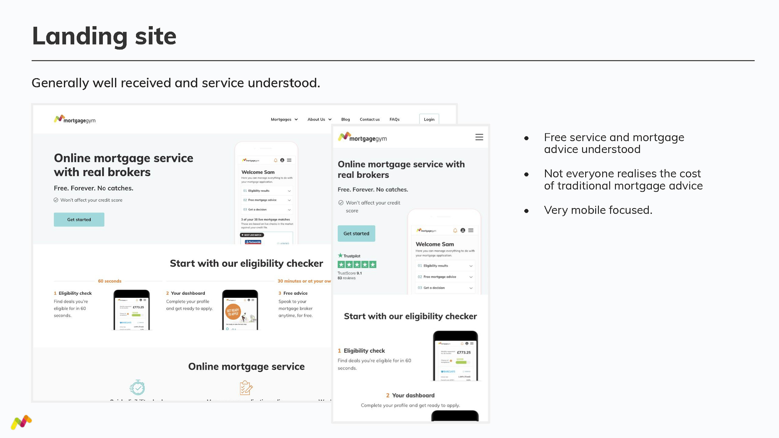
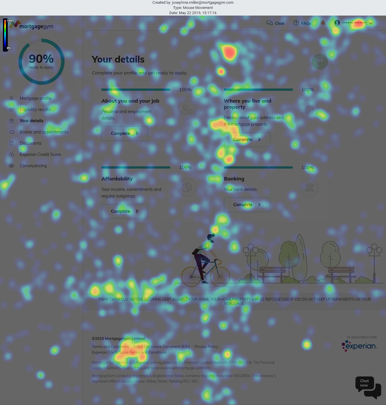
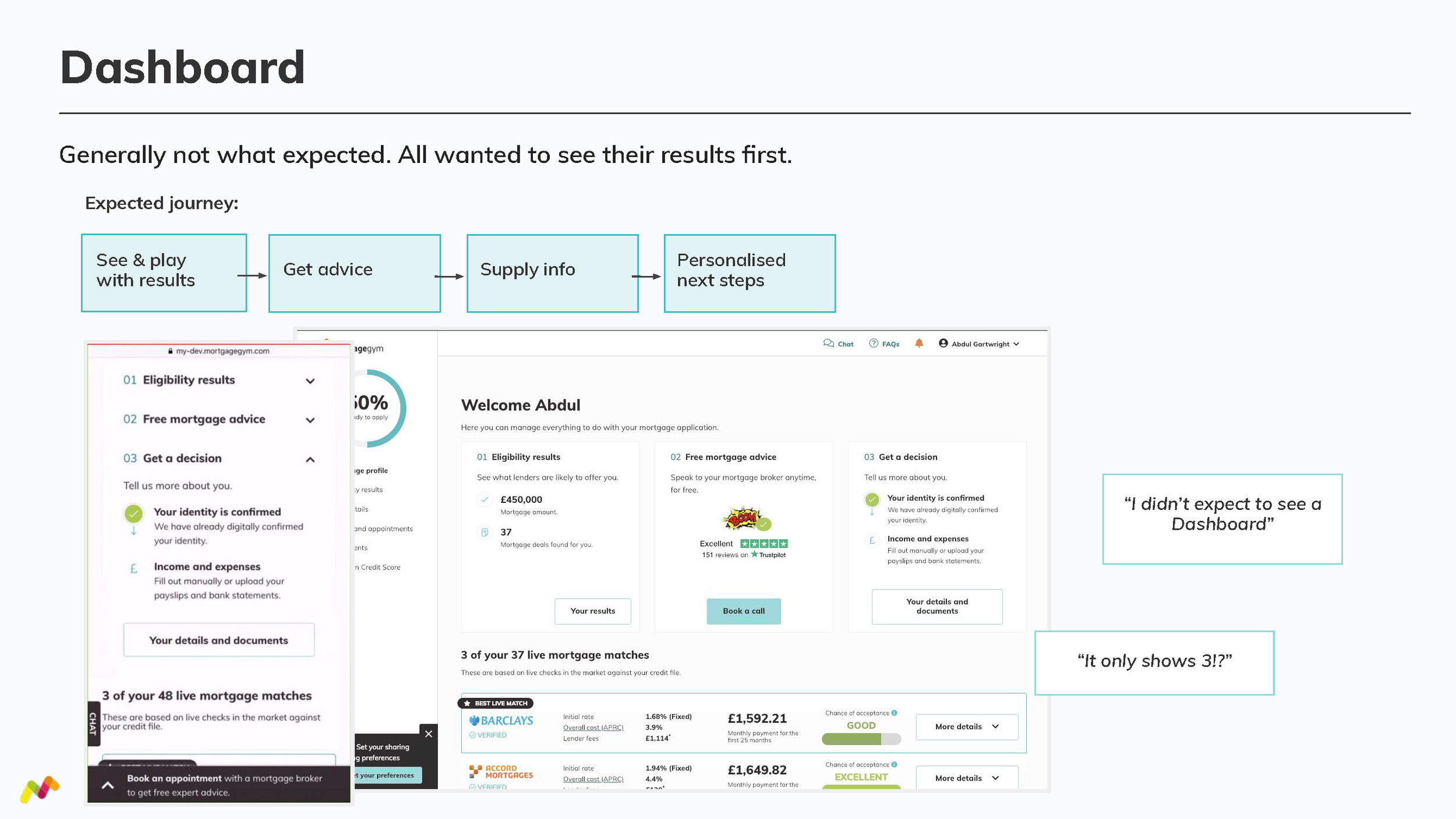
User interview findings



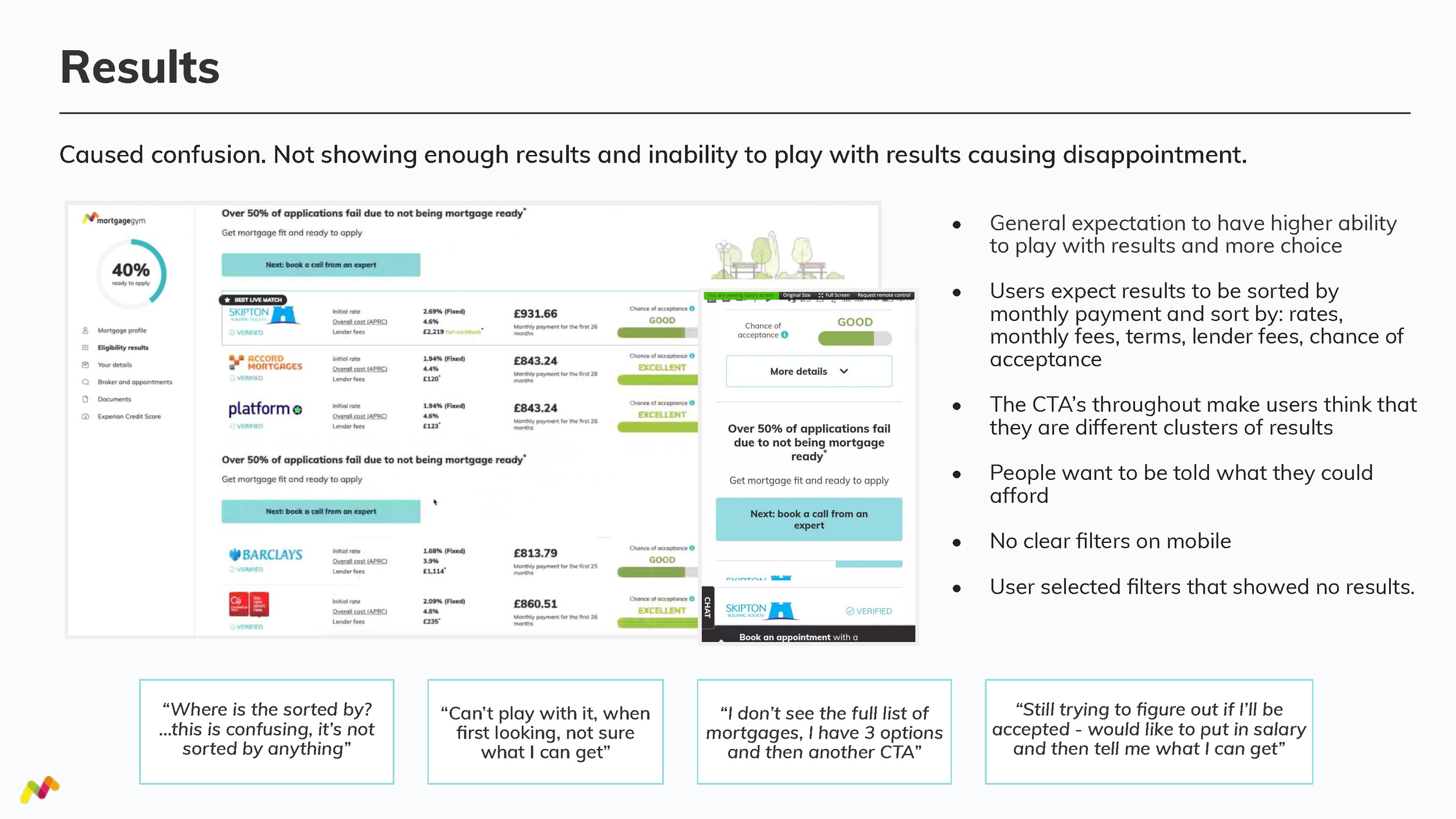
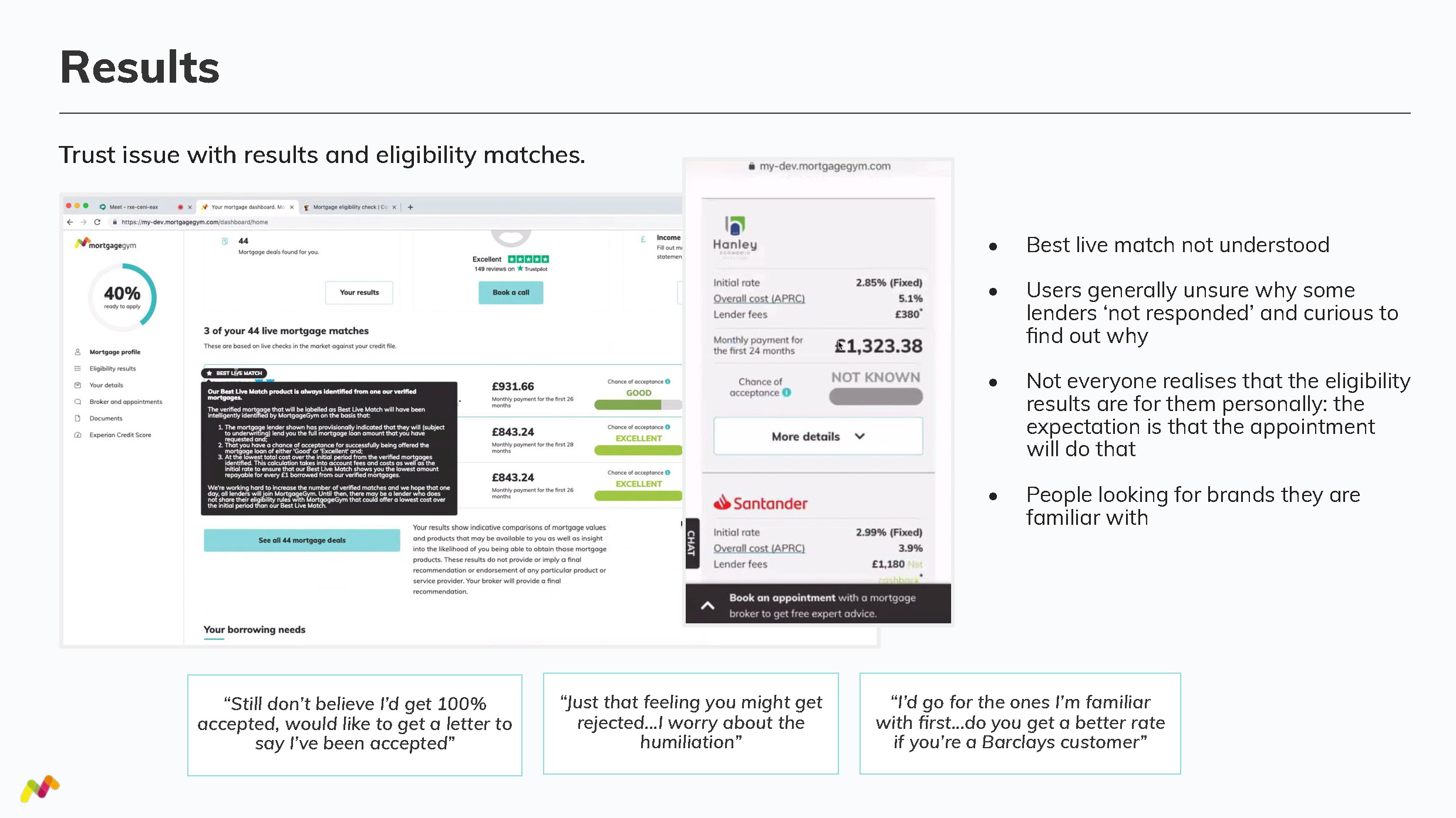


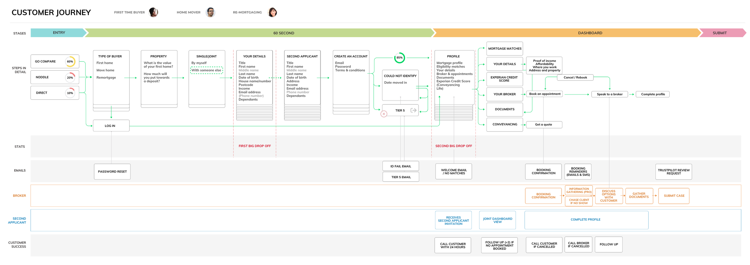
Customer journey and empathy mapping
The output from the research included an Empathy Map to illustrate the experience of getting a Mortgage to the rest of the team and Customer journey maps highlighting pain points and a series of recommendations for improvements.
The customer journey map acted as a point of references, whenever we were making product decisions, reminding us what our user is expecting at each stage in the journey and what they might want to do next.
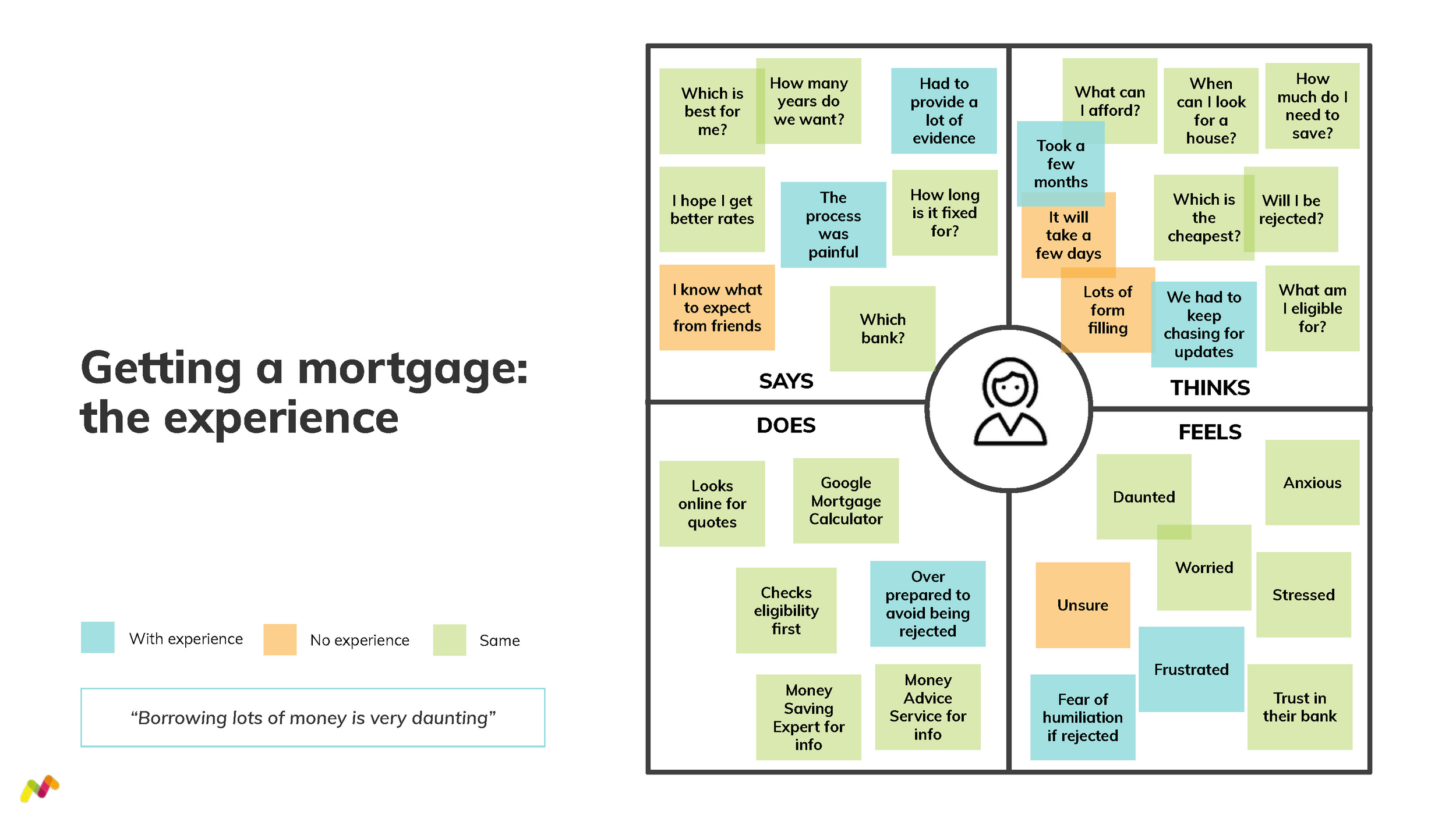
Empathy map

Customer journey map
Customer journey map
How might we make it quicker and easier for visitors to understand their Mortgage Results?
I ran a series of workshops to explore ideas for improvement, working closely with the Head of Product and using the finding from the research to drive the design strategy. I begun to prioritise the different improvement ideas to take forward, sketching and iterating, I worked through the wireframing, prototyping and testing and into full UI design.

Workshops with Founders, CTO and Head of Product
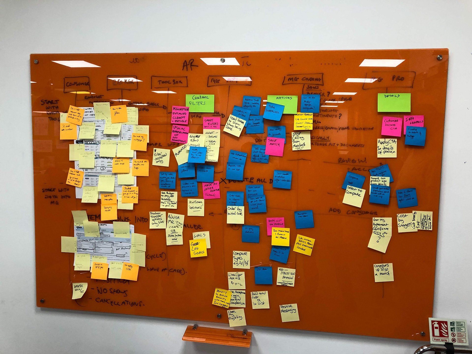
Workshop mapping
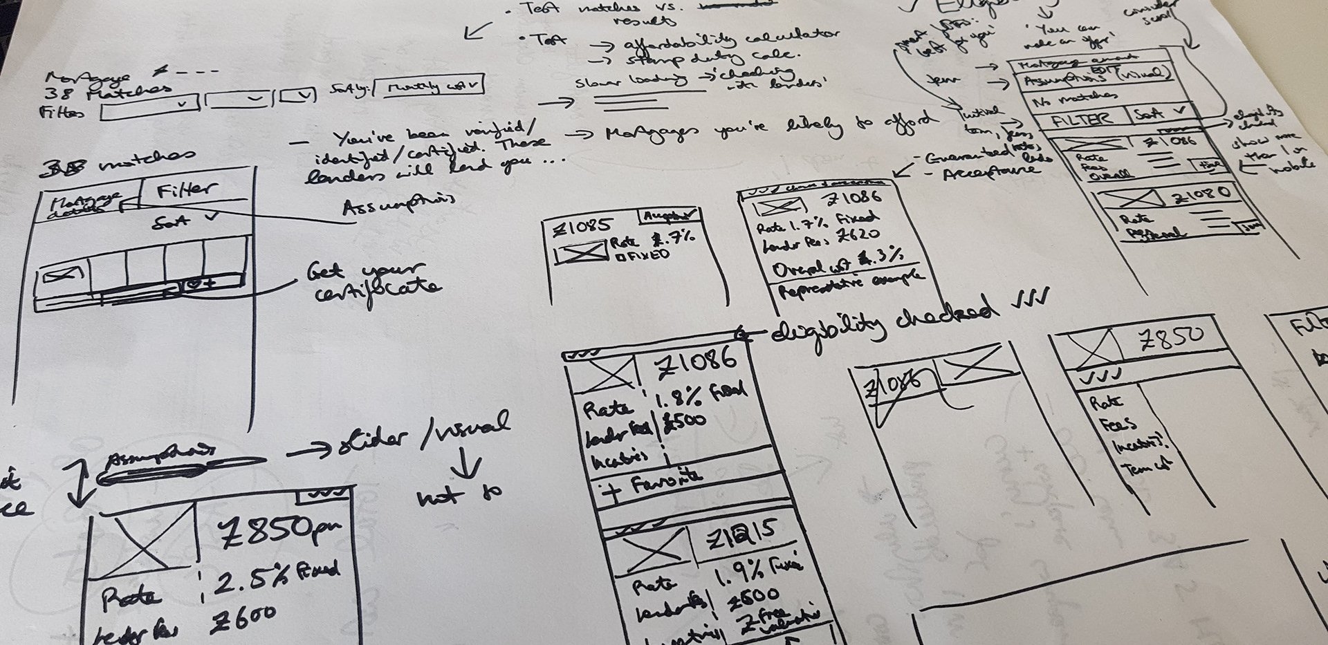
Sketching ideas
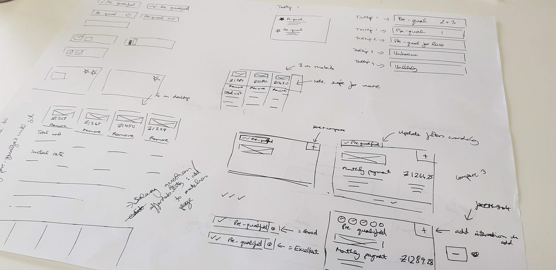
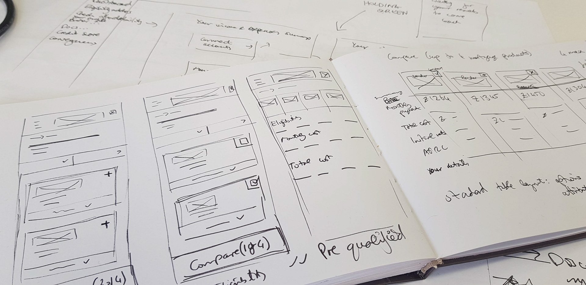
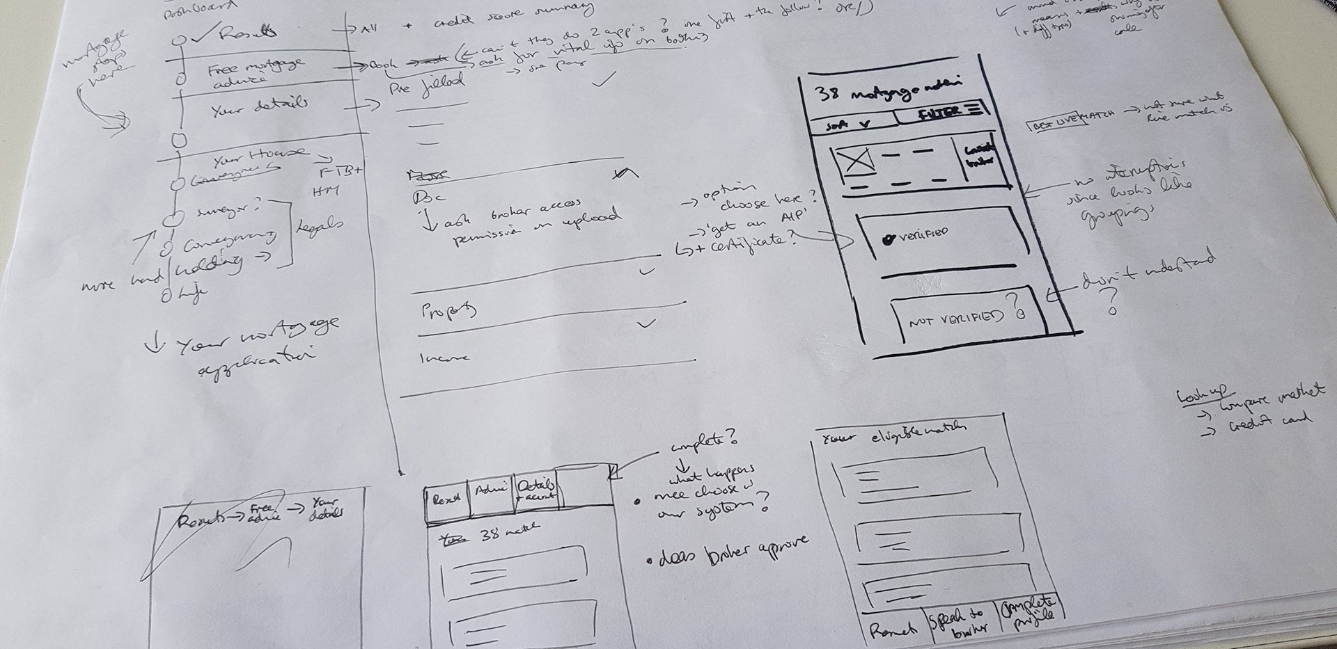
Improving Mortgage match Results
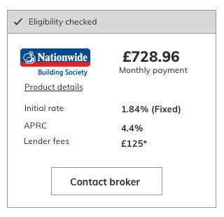
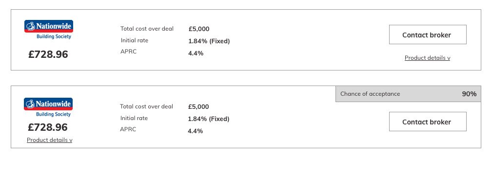
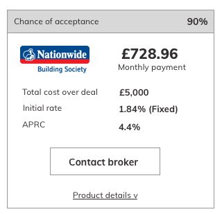
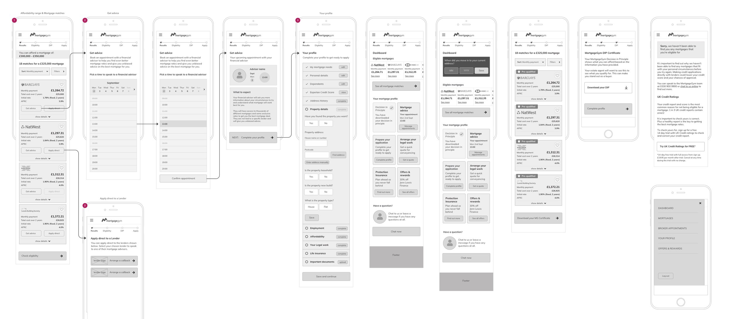
Following the workshops, I begun sketches and wireframing to present ideas early on and facilitate discussions. After a series of iterations, I built a high fidelity prototype to test with users.
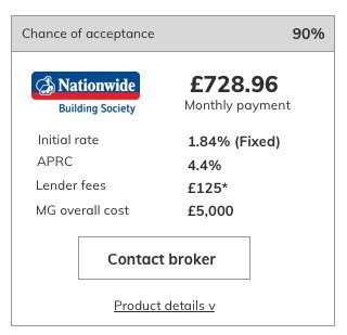
The part of the journey that caused the most frustration for users was the results page. It was not what users expected and was difficult to find, so we tackled this first. Cleaning up the page and adding the filters that matter most to users. We also ran an A/B test to alongside this, to see whether taking users to their results page earlier on would affect our conversion rates. We found that taking users to their results page sooner in the journey is what users expect and also increased our conversions rates to people booking an appointment with a broker.
I built a high fidelity prototype of the entire journey, with the results page earlier in the journey and newly designed, which testing much better in the next round of user testing.
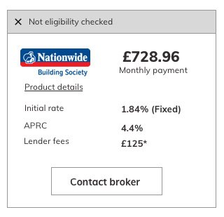
Wireframes
Building a Design System
I created a Design System to help us work more efficiently and consistently
Updated Calculator UI Design
Updated results UI designs

